Run Chart

Picture of Kerrie Preston

Published on 9 August 2018 at 14:58

by Kerrie Preston

run chart


A Quick Overview of Run Charts

 
Run charts is very simple to construct and interpret. It does not allow for the same level of analysis offered by a control chart but can be used with almost any process and with any type of data: measurements, counts, percentages, ratios, and so on. 


 Typical instances in healthcare would be:


  • Number of referrals
  • Falls per 1000 occupied bed days
  • Waiting times (Time taken between referral and first assessment)


Run Chart Example

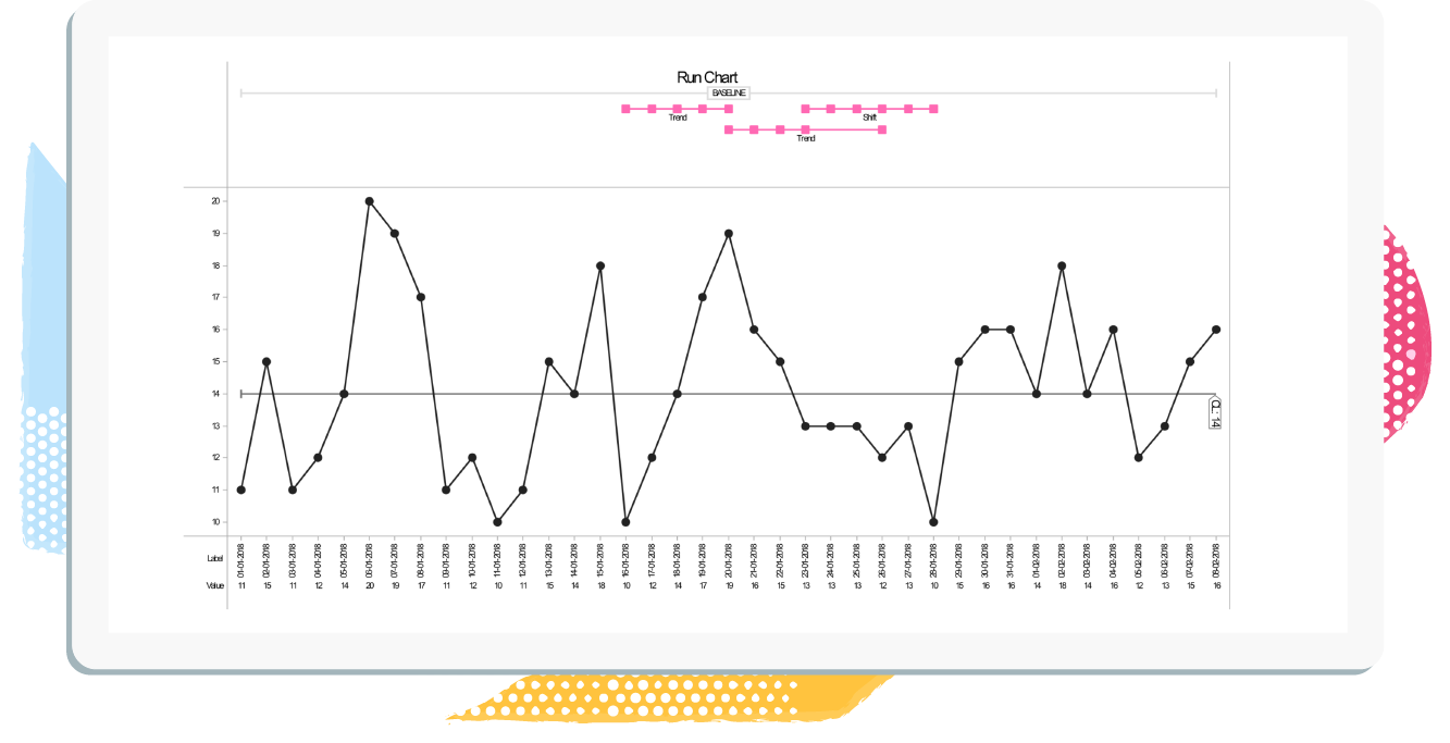
Here we will show you what data is required when creating a Run Chart and how this is reflected in the Chart itself. 


So lets say the 'Aim' of the project was to:

Reduce the proportion of patients with hospital acquired pneumonia by 50% within 6 months.

and the measure was:
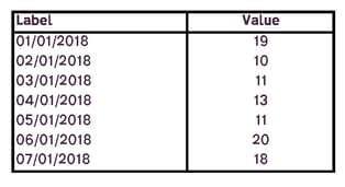
Proportion of patients receiving daily preventative chest physio a day.


You would need to capture the following data:

Label A label for each data point, for example the dates when the values were recorded. This data is plotted on the X axis of the chart.
Value The measurements/counts/percentages you wish to plot


Data Capture Example:

Proportion of patients receiving daily preventative chest physio a day
Run Chart example data sheet
 
Run Control Chart Example:
Proportion of patients receiving daily preventative chest physio a day


Run Chart Example


Start improving with Life QI today

Full access to all Life QI features and a support team excited to help you. Quality improvement has never been easier.

Free 30 day trial